
A Studio Called Chirp, logo
Custom-script ambigram
Custom-script ambigram
The logo for A Studio Called Chirp was published in the gallery of the 2013 PeachPit New Riders series book, Ambigrams Revealed.
After changing my mind over the course of a few years, I land on A Studio Called Chirp for the name of my design shop. It's exactly what I want to communicate: friendly and fun, bright-sounding, and the name sounds like an opportunity to help others to find their voice.
I wanted my logo to express all of that, and be clever and creative. While I was concepting, I noticed the letters lent themselves to an ambigram (the same when rotated 180°). I thought that if I could pull off a legible and well-produced ambigram, it would have to be clever, creative, friendly, and fun. I also knew it would take quite a bit of work to make it both an ambigram and readable. This is a piece I truly crafted.
I wanted my logo to express all of that, and be clever and creative. While I was concepting, I noticed the letters lent themselves to an ambigram (the same when rotated 180°). I thought that if I could pull off a legible and well-produced ambigram, it would have to be clever, creative, friendly, and fun. I also knew it would take quite a bit of work to make it both an ambigram and readable. This is a piece I truly crafted.
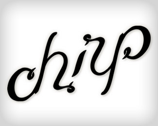
Early trial-and-error got me this far. It was legible. The most important driving force in the design is the ligature that combines the dot of the "i" to the beginning of the "r". Not only is that development the key to making the ligature functionally readable when rotated 180 degrees, it led me to create an upward slope for the script. When placed on a horizontal slope, the "r" began way too high, and by rotating the baseline of the word, I was able to create an ambigram that barely looks like an ambigram.
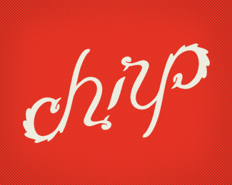
When I refined the script and added spurs to the letters, I felt I'd incorporated baseball vernacular in the script. Because of my interest in sports identity, the ability to fit into baseball culture was important. In the end, though, I wanted to communicate a chirping bird because the goal of my design business is to give voice to people and organizations, and that direction fit in better with my vision.

Feathery primary logo for A Studio Called Chrip.

Secondary logo to add the entire name of the studio.
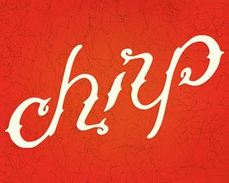
When approaching this logo again, I wanted it to be more playful, and the Chirp ambigram to be more refined. I'd seen a couple of improvements that I thought could be made years ago, and after all that time, I couldn't stand it anymore, so I started on the brand update.
I made the vertical strokes of the script wider and bolder, then I paired it with sign painterly and condensed typefaces. Those improvements give it a casual vibe.
I paired it with variations of the tagline "Branding & Custom Lettering with Love & Kickassmanship." For me, that cements it as laid back and playful, but with a touch of boldness. And that's the kind of client work I want to be able to provide: Professional, ownable logos with personality and creativity.
I'm fully satisfied with how this turned out, and I think it'll look fresh for years before it needs any tweaking.


